Housing inventory remains at all time lows and interest rates are still a challenge. But as we move into spring, it’s looking like buyers have accepted these hurdles as the “new normal.” Today’s house hunters are coming off the sidelines, realizing that waiting to jump in may mean losing their perfect house. With that said, most buyers still expect homes to be move-in ready with a model-home look. Being the smart, on-the-ball real estate professional that you are, you know that staging done well makes all the difference. Don’t skimp on staging and ensure your clients get top dollar. Sell for highest and best with these home staging tips:
There’s more to jaw-dropping staging than decluttering, depersonalizing, and deep cleaning. Staging that results in multiple offers also includes a number of directives that are more nuanced.
TIP #1: KNOW WHO YOUR POTENTIAL BUYER IS
Stage for the buyer that will most likely snap up your listing. Is your buyer a family with young children? Or professionals that need home offices? Empty nesters, or a multi-generational? It helps to understand the buyer that will be most interested in the neighborhood you’re in and the type of home you are selling. And then stage accordingly. For example, if you know it’s a family with kids and the parents will most likely be hybrid-remote, make sure to stage one of the bedrooms as an office.
#2: DON’T BE TOO SAFE

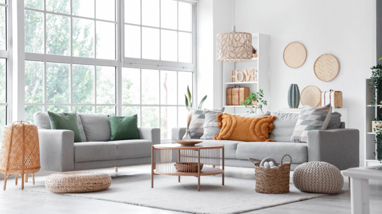
Most agents already know that staging a home to sell means creating a blank canvas in which your buyers can easily visualize their belongings in the home. On the other hand, being too generic and bland can make a home feel boring and drab. Make sure to incorporate pops of color in key areas and add a bit of something unexpected here and there. You want to shoot for neutral but with personality. Do this by adding carefully curated art and colorful textiles, like throw pillows and rugs. Items with texture, like baskets, and greenery or plants placed in strategic corners also works well.
Use this no fail pillow formula for couches: On one side a 24 X 24 pillow followed by a 20 X 20 inch pillow and a lumbar. On the other side just a 24 X 24 and a 20 X 20 inch. Invest in quality pillow inserts and swap out covers to fit the season: faux fur and knit for cooler seasons, and crisp light materials for hotter weather.
#3: STAGE FOR BEST PHOTO RESULTS
Home hunters start their search by going online to look at homes. As such, photos of the home are of paramount importance. Do not skimp on getting professional, quality photography and drone shots of the property so that potential buyers can adequately and correctly assess the home. One major faux pas that will have buyers scrolling past your listing is to make the main image an interior shot. People first want to see what the house looks like from the outside. Then if everything looks good to them, they will continue to scroll through the interior images. When staging, make sure you stage furniture around a window or fireplace since photographers typically use these areas as focal points.
#4: AVOID ANGLED FURNITURE
Angling furniture in a room is usually one of the worst things you can do because it tends to distort the dimensions of a room. People mistakenly think placing furniture at an angle will make the room feel bigger, but it actually does the reverse. Resist the urge to do this unless you’re wanting to define a space (like the chair in the picture below).
#5: USE AREA RUGS

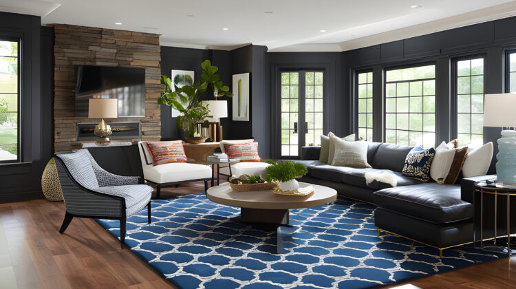
Like art on the wall, the right rugs on the floor can make a room pop. Area rugs and carpets help to define the space in a room and anchor the furniture. This is particularly important when working with large open floor plans. Create “areas” with area rugs. If there is a lot of dark flooring and you want to lighten the space, a light-colored area rug will do the trick nicely. One caveat: make sure area rugs are proportional to the rooms and space you are working with. Large rooms will need larger area rugs. There is no need to buy expensive fine carpets–a good source is Rugs USA, Home Depot or Home Goods.
#6: AVOID USING TOO MANY FILLERS
Less is definitely more when staging. Avoid bric-a-brac and fussy fillers. Beware of too many small things. One big mistake is using small pillows on a big couch, or shelves with too many small frames and tchotchkes. Shoot for fewer and larger pieces rather than an array of many small items.
#7: USE THE RIGHT ART

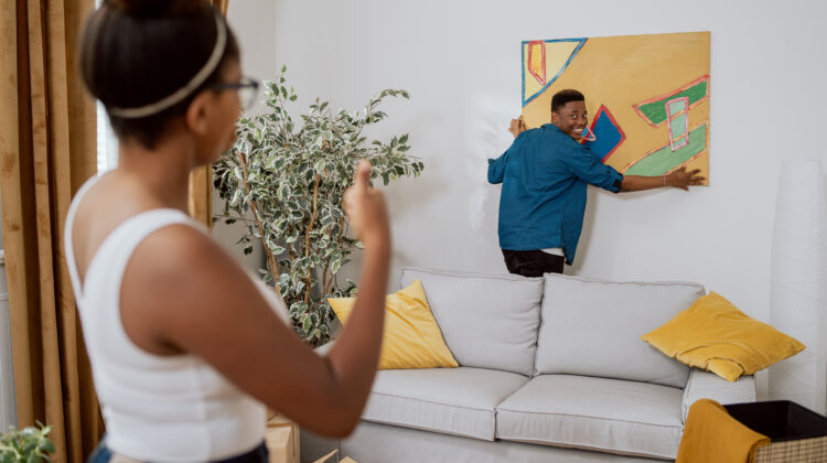
Now is not the time to hang anything that is overly provocative or “edgy.” Cheerful, colorful abstracts can be a good choice, as can landscapes, florals and plant motifs. A fabulous piece of art can transform a room as long as it’s in the right proportion to the wall and room size. The general rule: Either a single piece or grouping that takes up two-thirds to three-quarters of the wall space is ideal. A great way to “ground” a sofa is to hang a 50 X 40 inch rectangular canvas four to six inches from the top of the couch.
#8: MAKE SURE THERE’S GOOD LIGHTING
Light, bright and airy is what you are shooting for here. Create layers of lighting by using a combination of floor and table top lamps. And make sure window coverings are doing their job. Choose light colored fabrics or shutters. For homes without soaring ceilings, make sure curtain rods are placed two inches from the ceiling to give the illusion of higher ceilings and bigger rooms.
Statistics show that 75% of sellers see an ROI of 5-15% over the asking price when their homes are professionally staged. Investing 1.3% in staging results in a 7.1% average over-list return (2021 survey). Bottom line? Don’t skimp on staging and ensure your clients get top dollar.
