
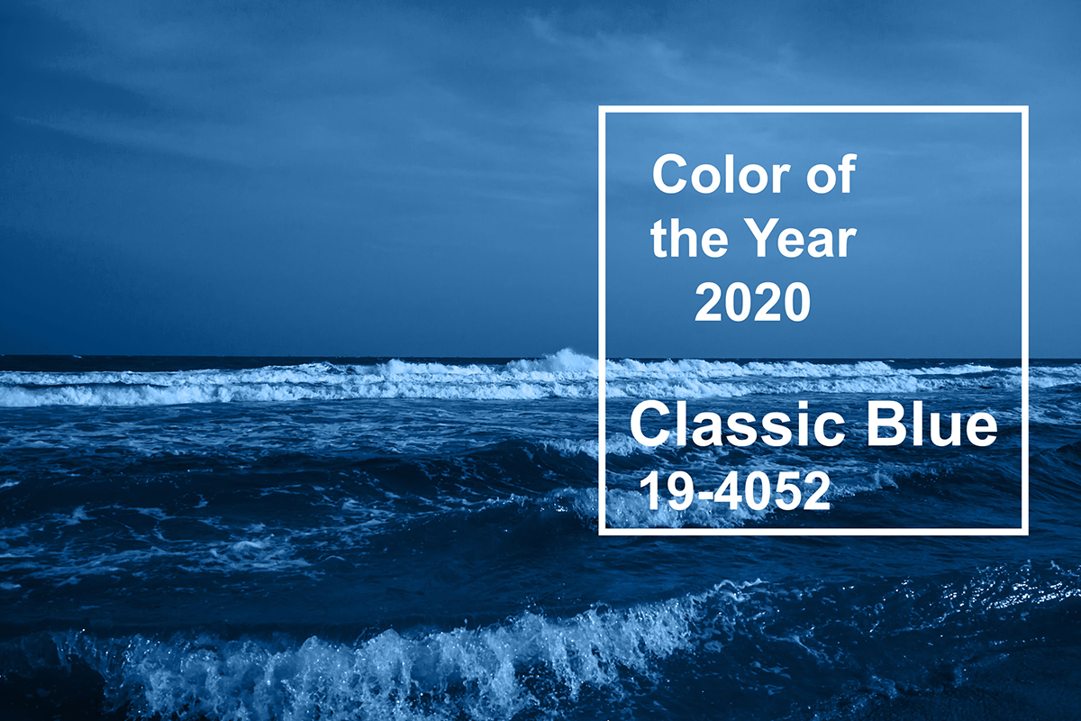
Pantone 2020 Color of the Year, Classic Blue, is a shade reminiscent of the sky at dusk. “It’s a color that anticipates what’s going to happen next,” said Laurie Pressman, the vice president of the Pantone Color Institute, which selects the Color of the Year. Last year’s Color of the Year, Living Coral was an immersion into vibrant warmth. Now, 2020’s PANTONE 19-4052 Classic Blue is elegant and simple. It provides a robust and familiar foundation upon which enter into this new decade. As described pantone.com, Classic Blue is “non-aggressive and easily relatable. Associated with the return of another day, this universal favorite is comfortably embraced.”
How Color of the Year is Chosen
The “business end” of Pantone is the Pantone Color Institute. The Institute’s color experts comb the global market in search of color trends. These trends show themselves in a multitude of ways, through fashion, travel, and the entertainment industry. Also contributing to their choice are cutting-edge artists and even socio-economic trends. This year, as in years past, the Pantone annual color pick will ultimately make its way into our everyday lives. You may discover it in your choices for home décor and in what you decide to wear.
Who Will Be Looking at Color of the Year
“A lot of companies look toward color forecasting and try to incorporate whatever Pantone is referencing as their newest colors. No matter what, Pantone is always spot on.” (Designer, Global Athleisure Brand)
Dive Into Last Year’s Pantone Color of the Year
What Colors Look Good with Classic Blue
Pantone Color of the Year challenges us to take a second look at a beautiful color we may not have considered for our home’s palette. Most of us know what colors we like. We even know which color looks appealing next to another. But let’s face it; very few of us would call ourselves “color experts.” If you like what you see in Classic Blue, take a look at what the experts at Pantone have chosen to complement this fantastic color. These meticulously sculpted Pantone complementary color palettes use Classic Blue as their focal point. Each palette is unique and beautiful.
How to Use Classic Blue at Home
2020 Pantone Color of the Year is a Classic for your home’s interior. Maybe you’re looking to create some neighborhood drama by accenting your home’s exterior – like its shutters, or front door, with a color that’s sure to get everyone talking. You can also shop for coffee mugs, keychains, and other items at Pantone that bring this beautiful color into your home.
Finally, whether you choose the careful pick of an expert at Pantone, such as this year’s Classic Blue, or a color you’ve always dreamed of using in your home, make 2020 the year that brings more color into your life.